

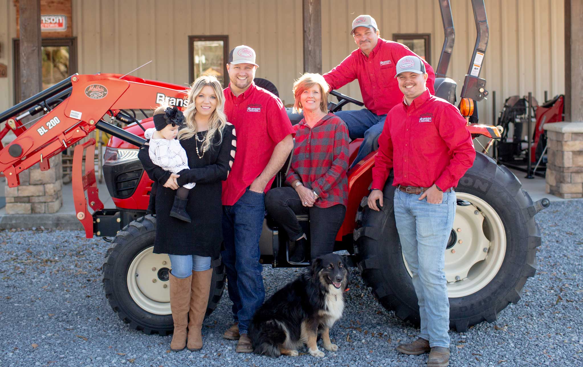
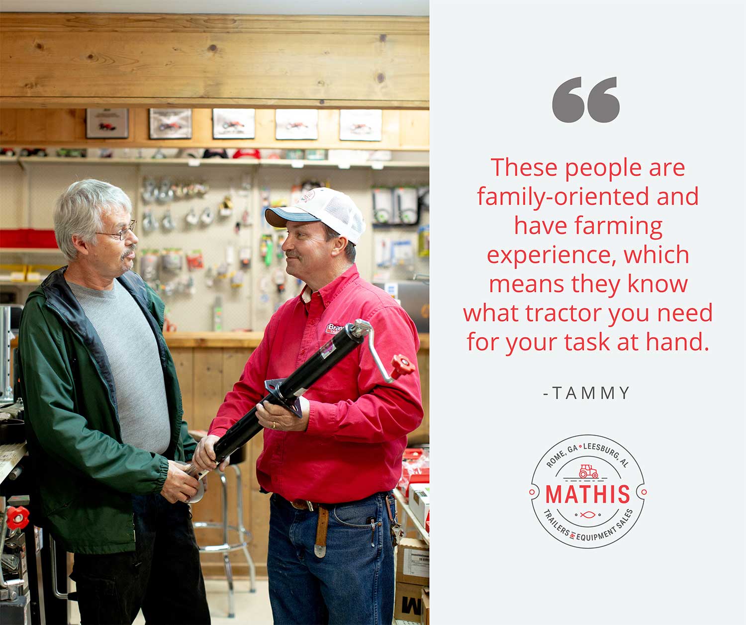
We’ve been working with Mathis Trailers and Equipment Sales since November 2019 and have loved creating campaigns, videos, Google Ads, and social media content for them. We also had the pleasure of updating their logo. Since we touch so many aspects of their business, we made sure to learn what they’re all about, so it translates well online, especially on Facebook, where they engage most often with their audience.
 One of the most important things you can do for your brand is to establish consistency. Not only does all of your content feel more professional and polished, but if your audience sees that you value small things, like the appearance of graphics, then that same attention to detail and dedication to your mission will extend to the rest of your business.
We’ll be talking about messaging in a future blog, but right now, we want to discuss graphics. Visuals are what will capture people’s attention and make sure your message gets across. At Romega, the design concept of Function Over Form rings very true, especially for Mathis.
Creative Projects Manager Becca Terry creates all the graphics you’ll see that come from either Mathis location. When we first started helping them with social, having rules set in place in the form of a style guide set her up for success.
“In order to do my job well and efficiently, I need a style guide. I consider myself a creative person and do great when I can try off-the-wall things with graphics, but that’s not always what you need for customers. In order to make graphics for Facebook, sometimes you need a process,” says Becca.
 Why Is Consistency So Important?
As a business, you know what your mission is, and in order to succeed, every aspect of your company should speak with a united voice. When you use social media, it’s important to use color, typography, and your logo appropriately so your followers immediately recognize you, and that you appear as professional as you are in your work.
Some people may be more inclined to work with a company that cares about those small details. It shows a dedication to their work and mission that wouldn’t be visible otherwise.
Here are some of the guidelines we set and follow for Mathis and why we set them in the first place.
The Logo
We had the pleasure of partnering with Mathis to create a new logo, so this step looks different than for many of our clients. We were able to hear directly from them what they wanted, make it a reality, and figure out the best ways to use their logo.
What we came up with were two versions, both simple, to-the-point, and easy to read. Their main logo, a circular one, was inspired by a cattle brand, calling back to the business that started it all for them: their feed store. Within that circle, there are also some elements to speak to the fun and casual nature of working with them, including a small tractor and ampersand.
![]()
Because it represents their brand so well, this is their primary logo. However, because of the more unique shape and detail, we have a simpler, text-only version that we use on more complex graphics or graphics with less room.
Their logo lives on every graphic we post on their Facebook pages, further reinforcing their brand.
The Typography
The logos use a font called Aktiv Grotesk Condensed, which is also used on their website design (coming soon!). However, we also utilize Open Sans, a sans serif font that’s easy to read.
Legibility is very important. Going back to Mathis, in their work, they don’t beat around the bush. They get right to business. Information like a sale on tractors needed to be front and center, without a flashy or decorative font.
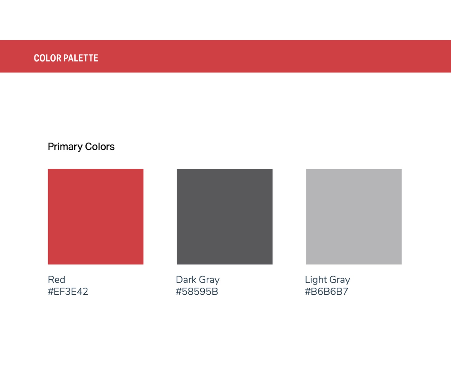 The Colors
When establishing colors for their brand, Mathis definitely wanted the color red. One of the biggest things they’re known for is being a Branson Tractor dealer, and those tractors and branding are also red. Choosing a palette based on the products you sell can be a great starting point.
To complement the boldness of red, and to offer great contrast, we also used black. A light and dark grey, as well as white, rounded out the main color scheme.
A beneficial part of figuring out a brand’s colors is that it rules out other color options. For example, it’s difficult to use green with their bright red as graphics with those can look too Christmas-y, so we primarily stick with neutrals when creating graphics and other visuals for Mathis.
How We Follow These Rules
 We use programs that allow us to save a library of fonts and logos, which makes our graphic process that much more efficient. After creating each graphic, other members of the marketing team will check it to make sure we’re using everything appropriately. Having our style guide means everyone is already on the same page, so feedback and critique can be delivered quickly, making the process even more efficient.
Once we have gotten attention with cohesive, eye-catching graphics, the most important part comes next: Engaging directly with their audience. In our next blog, we’ll show how Mathis does that though word choice and tone that is driven by their goals.
If you’re looking for a qualified graphic design and marketing team to help you unify your voice, we want to help! What message are you trying to send?